Becca Wright Interiors
Services
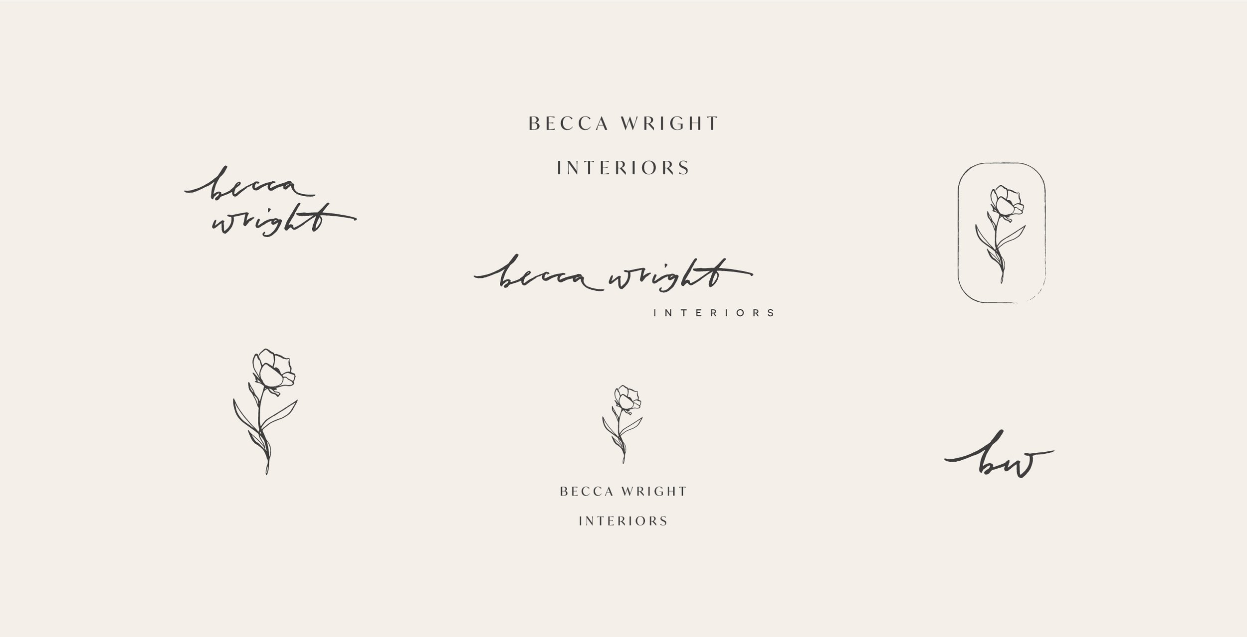
Logo Family
Typography System
Color Palette
custom illustrations
overview
Becca came to me in the early days of her design business as she knew she wanted to start off on the best foot! With a love for making a house a home, Becca’s secret sauce is in her wabi-sabi balancing of rustic charm with effortless elegance.
goal
Being in a visual field the aesthetics of her Interior Design brand had to set the tone for her offerings and jive with her specific style. The branding needed to be minimal enough to allow the interiors work to shine, yet show off Becca’s warm personality to draw in clientele and find perfect fits.
process
Pulling from visual cues that make up Becca’s own home (whites, blues, flowers) I built out a brand that felt like an extension of her own self. A signature-esque logo and a custom flower illustration bring a hand-touched and personal feel, while an alternate logo in a classic and clear typeface and a limited colour palette balance it with a modern nod.